Then look past the whole pie chart, it were a easy way to represent a total.
1 Like
I still don’t get it… blue slice = what… flavor… vg… nic… SB? It’s just so confusing.
There will need to be a guide for what each color represents to decode this graph/chart/pie/cake.
Already there’s a color coded bar underneath each recipe to break down vg, pg and flavors…
I just don’t see it adding nothing but more confusion for a noob… I been at ELR forever and I’m lost here.
Other variables is equipment (pod, sub ohm, super sub ohm, tanks, drippers, max vg or pg)… a lot of mixes are made for a certain type of vaping.
2 Likes

Joking aside, here are links that will describe a lot better than I can why pie charts are just bad:
3 Likes
So much truth! Well put sir.
I started to comment earlier about so many who don’t SFT… There’s no way to account for how a mix will change when you don’t know how an individual flavor can (will, and does) change IMO!
5 Likes
I do single flavor test the flavors that have very little data, notes, %, I have to, because it would just be a guessing game if I did not. I test for longevity also with that flavor. But I get enough info off the shake to consider where I want to go with it.
3 Likes
While I understand your example… The problem lies in the fact that (as mentioned above) that different manufacturers have different strengths (even within a single brand’s line).
Never mind the bad numerical examples above (because, as you noted, anyone who would use alpine strawberry flv is going to be prominent at much past a drop or two) but even with the “proper understanding” of the chart, a newbie isn’t going to know how to it to his/her needs because of the various phases of quitting smoking, or how good/poor their taste buds are. Much less differences in vaping styles or hardware…
Even IF one were to accept your premise (idea), you’d still have to overcome a mountain of obstacles.
How do you get 0.02 (1 drop of flv alpine strawberry or rich cinnamon) to equate to 25% of a pie?
Especially given that the same pie size (25%) might be 8% in FW, or 4% in Capella…
You’d literally have to have tested every flavor, to have spatial relevance to any counterparts (so to speak). And then, you’d have to code for them. Individually. There’s just no blanket rule you could make, much less apply! Because some TFA are used at 8% (for me), and others are used at 1 drop (or even a 10% dilution… 0.01%: Kona coffee).
It’s simply not executable IMO.
Sometimes there’s no better teaching aid than hands on experience. Along with a LOT of reading of the “base reference material” (ELR) ![]()
4 Likes
And there’s no harm in that, nor do I mean to imply that your approach is wrong or good/bad or indifferent. The key is, you have enough experience already to know what works best for you! ![]()
3 Likes
I know what you mean, and I do get the counterpart to this idea. Especially with the aroma strengths of the different manufacturers. I’m just thinking out loud, or on text if you like. Since I do belive that DIY’ing have a great future within any vape related community.
How to deliver that experience in an easier way to new mixers. And I’m happy the response this thread have gotten, even tho it’s a bit off the OP. Which is great, cause it gets us debating. And maybe we can have an idea on the table that is actually executable.
I have a tendency to maybe overthink and at the same time simplify things. If you could at a glance see the main notes of a recipe, with its backnotes, how do you present this the best way visually? The pie chart were just what popped up, since I’ve seen it before. But the idea is not limited by that alone.
But yeah, its a nut ![]()
3 Likes
If we look away from the bases, pg, vg and nic (pg or vg) and looked at the aroma combination alone. That is what I’ve tried to badly present in an simpler way with the idea. I do get the hurdles one would have to jump to present something like this in an appealing way.
I’m not gonna pull the language card, but I do see that I could have put it in a better way ![]()
4 Likes
Thanks @Pro_Vapes Bookmarked !!
I’m hoping this method of layering will pull me out of a mixing slump, where I’m blending everything and the profiles I’m Vaping are getting very boring. I’m not wanting to smoke at all I just get bored very easily. I guess I could say I’m going to transition to the next lair of the Rabbit Hole. Mixing & Vaping seems to be my happy place it really helps along with my Meds. To help somewhat with ptsd Shit. Just got to convince myself that mixing has it’s aggravating side but also has a therapeutic side. Sorry didn’t mean to Rant please excuse me.
5 Likes
I’m all for improving the system, and the understanding thereof! And I totally respect where you’re coming from!
As for being able to see the top, middle, and bottom notes, in my experience, that only comes with time and familiarity with the flavors you’re working with.
5 Likes
Its not possible to simplify experience, which is what flavor knowledge sums down to. And to some extent it maybe takes a special breed to be doing SFT and time after time adjust variables. I might be to naive thinking this could be “easily” done by anyone. Which might be why one shots is growing bigger ![]()
I know at least I would have given up a long time ago if it had not been for the regulars on this forum.
To hell with the “cake diagram” ![]() I see the challenge, and it’s not something that would prove too usefull haha
I see the challenge, and it’s not something that would prove too usefull haha
3 Likes
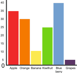
Something like this bar diagram could be feasible, but matching each color to aromas would be a task in it’s self.
I could see it being incorporated into the calculator in relation to flavors entered into a recipe and being measured by volume or weight used in the mix.
any opinions @daath?
5 Likes
Personally I think  welll nothing really. So I guess I am underthinking the over thinking this topic. Lol
5 Likes
I felt this way also when the aroma and pie chart was mentioned. But this diagram is totally flavor measurements used in a recipe, (which is what I think @Mausberg was trying to say) and it does make sense.
Every flavor you enter into the calculator will create it’s own bar in the diagram. Then you can visually see each flavor in comparison to the other used in the mix.
Just imagine Wild Raspberry MF being a top note @ .05%. It’ll more than likely be the shortest bar on the graph. Then Bavarian Cream TPA at 4% being the tallest bar…
For a noob it’ll be a visual reference that you don’t need a higher % of a flavor to achieve a top note. You can easily understand flavor strengths or differences in 1 brand to another.
6 Likes
At the end of the day shouldn’t we be preaching process? Each palate has its own range in which each individual has their own low medium and highs that they need to identify for themselves. Identifying these are the true secrets that need to be discovered. After that it’s as easy as running downhill!
5 Likes
I know what you’re saying and I’ve done that too. It’s just another tool to help learn the process. It actually teaches the difference in flavor strengths and brands at a simple glance.
The best part is if it can be incorporated into the calculator then it takes no effort from any individual… It’s just free extra info. If it can’t be incorporated then all this becomes mute.
4 Likes
Your bars makes more sense than the initial pie. And the quoted line hits the nail dead center ![]()
I dont know if its alot of work to implement something like this, but that would maybe get the learning process along faster for alot of aspireing mixers.
5 Likes
I kind of like the quick reference idea not a huge fan of pie charts (pie yes charts not so much)
I think it would be a cool idea to have a reference to median usage.
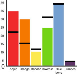
the numbers down the side would be % so there would be a decimal point
7 Likes