Same, think I saw it in an app that I never use. But the idea is compelling, and in some ways I think it could give some a better understanding of a composition of aromas, over just reading a list followed by numbers.
You know, artists use their brain diffrently than engineers etc
edit:
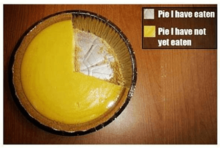
I’m Norwegian, and it’s 05:30 in the morning over here… Cake diagram made so much sense in my head, haha
A chart like that could get a little weird when mixing flavors… considering the strengths of some flavors. Weaker flavors will be disproportionate to stronger flavors on the chart.
Like a raspberry cream…
4% Bavarian Cream TPA
.15% Wild Raspberry MF
Although the WR MF will dominate the aroma, by weight it’ll be only a sliver of the pie.
Hmm, did not think of that. But I’m sure there is a way to have a minimum size of a sliver, so that it would not be drowned by the others.
Like make them relative to each other with rules.
This gives another idea, known extremely strong aromas should have like a notification to them, which also could be present in a pie chart too. Like the sliver has a inverted outline.
Ok this is going over board quickly haha intelligent pie chart widget.
Yeah, there’s more ways to display something other than my cake diagram idea lol.
But I’m sure the scholars of code have easy know how’s to make exploding cake diagrams, not to drown the 0.05%'s and other upsteeping ultra concentrates
Oh, a bottle with a dripper cap, filled up with diff colors representing each aroma… now were talking!
Pie charts are notoriously inaccurate for representing data. Take a complex recipe that has let say 12-ish flavors, and you won’t even see flavors with lower percentages, and if you increase sliver sizes, it wont represent the flavors as it should.
It’s not about the accuracy for representation, it’s about just making the relativeness shown, aromawise.
There are ways to do this, as there are ways to set a minimum size for a “slice”.
It does not really matter what the visual aide would look like. Just as long as its a way to display the aroma usage %'s in a way that is not numbers and lists. While being simple enough for anyone to understand.
Example: My blueberry muffin recipe. Where I use 3.5% blueberry muffin (flv) as the main chauffeur. While the rest of the aromas are 1.7 and down. I know there would be a bigger slice of the 3.5% one, over the 0.5% ones. And displaying this with a pie chart, or other means simmilar, is not about accuracy, cause the accuracy is already there, in the lists and %.
If instead of using the actual percentage of each flavour you use the relative amount of each flavour, eg 3/4 of the full SF amount for flavour 1, 1/2 flavour 2, 1/4 flavour 3 … Then I guess it could be used as a visual representation of the flavour profile, i.e. give people a quick way of seeing what the mix would taste like.
But simply making a chart over the amount of each flavour would imo be completely useless, as the strength of different flavours simply vary too much. Such a chart would tell you nothing about the flavour profile of the mix.
I’m open to all suggestions, and some might adhere to the pie, but like @Pro_Vapes said I’m all about the numbers and a full written profile of that flavor by many testers, and take a look see of that flavor used in recipes, than compile that info, into one number % for the recipe I will be making.
I get better results and understanding of a flavor by multi-flavor testing, than I do by single flavor testing.
I use imagery all the time but somewhat differently. I envision top notes and single flavors as a QR code with the dark area representing the top notes. In the case of a weak or light flavor I know I need to build the flavor. Then I progress to painting in the white areas to round out the recipe.
You are at the harbor and have missed the boat, this should in no way be a replacement of how we make our recipes. Just a way to give the aromas a representation visually. And probably does not cater to the experienced mixers in any way.
Useless or not, not everyone come at DIY’ing understands why aroma 1 is set at x % and why aroma 2 is set at z % in y recipe. This is meerly a suggestion towards visual aide for “newbs”, no more or less
And I do agree, the flavour strength play a huge role in disfavouring something like this.
This is meerly a suggestion towards something that could cater for new mixers to ease into the “mindset” of other mixers. And thus learn the buildup of a recipe faster. But there is still no way around learning the aromas the old fashioned way.
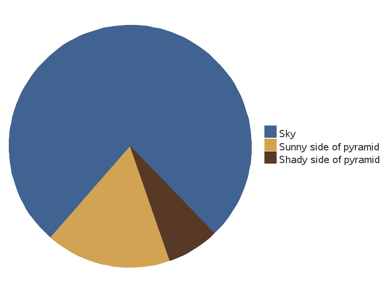
I made a very small sketchup of what something like this could look like:
This wheel is way to big. And dont even need to be a wheel, it could be another bar under the nic/pg/vg bar too. People think diffrently towards certain tasks, and mixing a juice for some are a task better understood by simple visual aides, over lists. However, most will have to abide by the numbers no matter what, cause some aromas are super strong and would be misrepresented in something like this, no matter what. But then again, if you do own alpine strawberry and still use it at 2%+ you are also still missing the boat
I started to comment earlier about so many who don’t SFT… There’s no way to account for how a mix will change when you don’t know how an individual flavor can (will, and does) change IMO!
I do single flavor test the flavors that have very little data, notes, %, I have to, because it would just be a guessing game if I did not. I test for longevity also with that flavor. But I get enough info off the shake to consider where I want to go with it.
While I understand your example… The problem lies in the fact that (as mentioned above) that different manufacturers have different strengths (even within a single brand’s line).
Never mind the bad numerical examples above (because, as you noted, anyone who would use alpine strawberry flv is going to be prominent at much past a drop or two) but even with the “proper understanding” of the chart, a newbie isn’t going to know how to it to his/her needs because of the various phases of quitting smoking, or how good/poor their taste buds are. Much less differences in vaping styles or hardware…
Even IF one were to accept your premise (idea), you’d still have to overcome a mountain of obstacles.
How do you get 0.02 (1 drop of flv alpine strawberry or rich cinnamon) to equate to 25% of a pie?
Especially given that the same pie size (25%) might be 8% in FW, or 4% in Capella…
You’d literally have to have tested every flavor, to have spatial relevance to any counterparts (so to speak). And then, you’d have to code for them. Individually. There’s just no blanket rule you could make, much less apply! Because some TFA are used at 8% (for me), and others are used at 1 drop (or even a 10% dilution… 0.01%: Kona coffee).
It’s simply not executable IMO.
Sometimes there’s no better teaching aid than hands on experience. Along with a LOT of reading of the “base reference material” (ELR)
 intelligent pie chart widget.