The pie would work if it was based on @Pro_Vapes lead in suggestion. It would be an automated output based on Medians which are not-so-reliable (tabulated average of sketchy data). The pie would never need to change it would just represent “Top Note”, “Mid Note”, “Bottom Note”, “Poppers”. Those final accents don’t even really need a position in the pie as this would just be a tool to design something from scratch.
The bar graph would work better because of visibility. To consider your personal “median%” you would need two median lines. One is automated and one is a slider. That black line in @woftam’s chart above is fixed and driven by the Database. Add another line (white?) that can slide to represent what YOU think the actual median is personally based on your SFT/palate. Based on the selected Median% you just plug it into the fixed “pie”. Top Note = 50% Mid Note=33% Bottom Note=15% Poppers=2%
Proper Pairings could be considered as One Note and fit in as Splits (two Vanillas etc.) into any Top/Mid/Bottom. It’s restrictive and counter to all the Freedom we enjoy in this creative process, but it could be a starting point to get a baseline for that recipe you are struggling to begin.
Coding the Math would be easy just those % (50/33/15?) X YOUR median%. If you agree or don’t have a personal preference for that flavors median% just slide the White slider to the black line (DB median). The output goes right into the recipe flavor weights. A test could be plugging in some of the most popular recipes into this matrix and see if it’s even close
Hey? Can I name the first recipe that comes out of the new ELRecipe Builder
“Mother’s Math Milk”
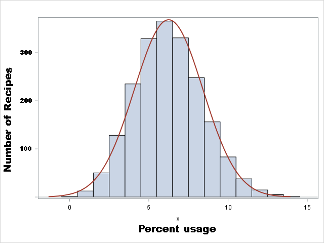
A proper SQL query could dump all the Flavor% (weights[remember specific gravities] vs DB Median%) from the top 100 recipe list. You could analyze that raw data by fitting into Top/Mid/Bottom and see if this approaches successful recipe design (the 50/33/15/2) or if another pattern (%) shows statistically/consistently. Exceptions could easily be caused by bad DB median%s, so consider that too (gets a visual column in the query output).
Yeah just for this Square One peek into “does this make sense?” It might be better to do that original Top 100 (2016?) The Super Concentrated flavors toss in too many variables for a simple raw analysis for any %pattern of “proven” recipes.
In all actuality a median isn’t really needed because the graph is made by that mixers actual recipe, so they are already using their personal flavor % preference.
Just for simplicity all things on the chart will be generated when a flavor is entered on the calculator. Flavor 1 = Bar 1, Flavor 2 = Bar 2 on the graph and so on. I am not a coder, but it seems kinda simple from what I’ve read about graph templates.
Then there will be a simple visual representation of each mix. This is actually for noobs and keeping as simple as possible for noobs might be best.
If the graph get too technical it can be counter-productive…
I had been thinking it would be handy to promote users to make single flavor tests in the recipe database, but force those tests to be segregated from the other recipes. but use a chart like some have described to visually show usage. that could also be applied into the flavor list to show individual flavors recipe usage. A bar chart might be the best and it wouldn’t be considered copying that other site.
imagine seeing this when a user looked up a flavor:
That might be easier than trying to do it for an entire recipe, and more informative than a pie type chart.