It’s like a cross between sour cream and butter. It’s good in some things as long as you don’t know it’s there. 
He’s one step away from producing human flatulence flavor. OMG please no.
I think the cake is too long you need short cake, kinda like the equivalent of a mini skirt
NO! lol
Just because you can, doesn’t mean you should! =P
“Remember, with great power, comes great responsibility!”
LOL so true
OK need your advise… Thoughts?
(Image removed)
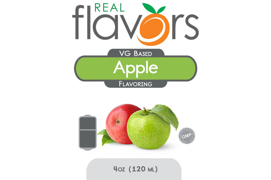
The image is good. Great. Gives a feeling of clean apple. I would shift the cut apple to the bottom.
You can tell there is a lot more to go but gives you the idea.
That should be the one for Double Apple. 
I like this, but maybe with the next post’s apple picture.
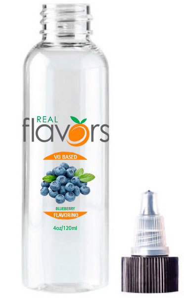
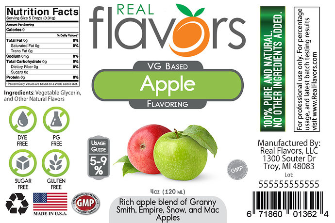
I love the design of the second label. Not the apples themselves, but the rest of the label. Easy to read and flows, looks more professional and clean to me. The first one looks like a table made in word or excel and printed out. I think the picture itself should reflect what kind of flavoring it is. if it’s Granny Smith top photo, if it’s a blend of red and granny then the second. I always associate the type of flavoring with the photo.
I vote for the second label as well, just pops more and is clear, the first label looks too generic.
I have to toss my hat in the ring for the 2nd example. It just looks more professional IMO.
Exactly my thoughts as well , if you are making a red delicious then by all means have a red apple @Walt_RealFlavors!![]()
I also like the label on the second pic , much easier on the eyes and it looks professional.I just prefer the apple to be one color , I like red for a sweet and green for a sweet but tart apple?
It don’t matter though you know some jackass will boast about how it is the best apple they ever had and we will have to have it!![]()
There you go! That is sweet looking!
Super beta but this will be the new look once the new site goes live. Planning a large marketing update Dec - Jan time.
PS… beta lol I see 2 errors they need to fix but it gives you some idea of the new features on the labels.
I love that there’s a % usage guide right on the label.
See lol… I listen ![]()


