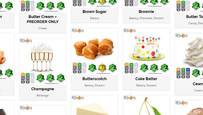
Actually now that you pointed out the little flags (order icon) and understand what they are, I can see some of them grayed out (meaning they are not in that form (super concentrate or PDO etc)). But unless the visitors to your site know this, they… like me… would have just thought those were nutritional value marking of some sort and would of ignored them… again, like me.
Thanks for pointing them out to me…
Nicely done on the addition of the super concentrate item on the grid… but for some reason the “Butterscotch” is in between the “Champagne” and “Cake Batter” items…
Also notice the Butter cream is followed by Brown Sugar and Brownie… alphabetically incorrect…
Weird bug lol. I’m looking in to it as we speak.
Thanks!
Ohhhhhh, I’m in trouble now  Did you all notice the pre-order for Bavarian Cream, Butter Cream, Souffle, Sweet Tart, Sweet Cream, and Milk? And Toasted Blend, that’s cool. And Sriracha…ugh…that’s for everyone that likes the Fried Chicken
  And when did Mimosa and Masala Chai and Soda Base get released? I’m way behind…lol.
It looks very nice, love the new formatting. Except the Categories being on the top instead of along the side of the screen. Looks awkward, but I’ll get used to it. You know how we all don’t like change 
The title of Cream is misspelled Ceam. Also when you click to the next page, the screen stays orientated on the bottom of the page instead of going to the top. Also the picture on the Butterscotch is not appealing…at all  The picture on the Coconut Cream Pie is a Banana Cream Pie, not coconut. Neapolitan Ice Cream lists that it’s a VG based Flavoring in the title, none of the others do.
Save me haha… Be scared that 8 other people did not catch these… I think 4 months of looking at the same site starts to make you see things.
These are both new with Almond
I did, dammit! hehe.
I am swearing off flavor buying until i get everything into single flavor samples and get them tested, or so im telling myself…
I noticed the first couple of issues as well, with the site. Looks good tho. Took me a moment to be able to squint enough to be able to see the SC/VG/PDO tags. Then i remembered i have a button on my browser so that i dont have to squint…
Not sure if I am going to keep that new product search page.
May just go back to the normal style lol
I like the page but it does take awhile to load. This machine is an older i5 tho…
I very much like the new design but i was around in the Geoshitties days and before so take that for what it is worth, hehe.
PS for helping, I am so send out free flavors 
I like the new one better to be honest as i cannot bump up the font enough to see the extra features on my laptop with a 20 inch 1600x1200 external monitor on the old style.
Carrot please, hehe. Or Pumpkin juice so i can finally find out why the hell Potter mentions it all the time.
Why does it only offer the first 3 categories (additives, bakery, berry) on the drop down menu when I hit the Shop button?
Just testing to see which is better is all. Which do you like better. The new menu or drop down?
First paragraph om About me page:
"Real Flavors is a privately held and operated wholesale VG flavoring company that has been satisfying taste with over 75 years of experience combined. We are a FDA certified laboratory capable of serving all types of industries from "
You are no longer a VG company, you have grown into a VG/PDO, and SC company 
Shouldn’t the a before FDA be an instead? Also says same thing on home page. Not sure of proper grammar, but sure sounds better 
Totalllllly agree
I like the drop down better, cleaner and less cluttered, and 1 click to get to my desired category rather than 2 clicks. Saves me time 
Under contact us, the onestopdiyshop is sporting the diy supplies logo, and the link is bad. Takes me to the Walmart. The rest took me to proper location.
I like that much better, just need to fix the formatting of the flavoring box that pops up above it now.
I oddly do not see that, can you screen cap me?
