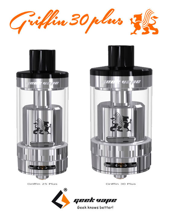
I found this pic online and guessed it gotta be a leaked pic from Geekvape or something.
Has anyone else stumbled across this or seen it?
2 Likes
The 30 looks like the 25 photo blown up, troll photo?
2 Likes
A uk reviewer said a few days ago that he had a feeling geekvape were in the process of coming out with a rival for the aromamizer 30. There might be something to it.
1 Like
Yeah, every shadow and glance is the exact same.
Also, look around the logo, it is clearly edited in. Pay attention to the dark gradient line on the right side of the photo and look at the top of that line, it makes it very clear that this has a bad photoshop job.
3 Likes
I don’t see any dark gradient line on the right side. I have been looking and looking to see what you mean.
Sorry i wrote wrong, i meant right side of the logo. Look at the top of that dark line, you can see that he didnt even smoothen that sharp line that clearly shows that the logo part is put there.
The part there 
If i look it kinda looks the same on both tanks to be honest.
I don’t know, the drip tip is the same size roughly eyeing it up I think. It might be possible I would assume it would have changed if it was doctored. I don’t think it is clearly doctored. However, until geekvape release it. I’m saying with certainty it doesn’t exist till that point, stating obvious.
Smok released a 12 coil it seems everyone thinks bigger is better. My little Petri begs to differ.
1 Like
Where did you find it?
Not sure how i can explain, but if you look at the small thumb above, you can see that the top of the dark line got a very sharp end. Not just sharp but pixel perfect sharp line towards the brighter part above where that dark line is much thinner.
Look at the original 25mm, and you will see that part actually smoothen out upwards with a gradient.
That logo has been added, he had to because the tank is scaled up, but then made shorter. If he kept the logo as such, the logo would reveal the photoshop due to it would have been stretched horizontally. Hence why he but out the logo, scaled that to fit and then added it again, but failed to smoothen out the top of that darker line at the right side of the logo.
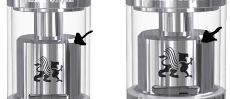
I hope that helps pointing out the obvious photoshop flaw!
Big call, there are as you put it pixel sharp lines on the left one too. Jury’s out for me till we know a lot more. Where did you find it would also contribute to the ability to judge validity.
The line pixel perfect sharp line does actually continue all the way over above the logo where that line separate color differences n other glance highlights both over and to the left as well, the dark line to the right it is just very clear. Exact same thing can be seen on the chimney too if looking close enough 
When that is said, it could be Geek vape who is behind this terrible photoshop, so the concept could be legit. I would however expect much better from such company. The guy who made this didnt spend much time throwing it together. Heck, i will claim that even though i didnt touch photoshop for some years now, i would be able to do a better job than this spending 30 minutes.
Vaping with Vic mentioned it on his show during his review on the aromamizer 30. He also dropped a hint that wotofo was bringing out a gta troll weeks ago. So I wouldn’t be surprised if it’s on the way
@Fenrir1 where did you find this? Or are you pulling our legs?
Maybe it’s to compete with that TFV64 that was posted on Reddit. 
1 Like
IDC because the griffin 25 plus was a big disappointment anyways 
2 Likes
Vaping on one right now… and wiping the leakages from the AFC ring 
1 Like
I’ve been debating about buying a griffin plus for the last 2 weeks or more. Your post and @KristianDK’s post just helped me make my decision. Cheers lol
3 Likes